mParticle rebrand: Turning customer data into customer joy
We recently unveiled our rebrand, a reflection of our enhanced strategic vision, refined focus, product investments, and commitment to making every customer interaction a moment of joy.

Welcome to the new mParticle! This isn’t just a new look; it's a transformation that goes deep into our purpose, mission, and the very essence of mParticle. We have redefined our core strategy to align more closely with the needs and aspirations of customers.
Our customers are doing big things, and they care deeply about the people they serve. At the end of the day, that is what motivates our new direction and is at the heart of mParticle. That is why we're on a mission to turn customer data into customer joy.
So, what's new with the mParticle brand? Let’s dive in.
The new mParticle
We are more than a customer data platform (CDP); we are a customer decision engine, orchestrating customer data in real time. This rebrand comes hand-in-hand with the significant investments we’ve made in our platform over the last several years. To usher in this new era of the CDP, we wanted our visual brand to reflect the changes we’ve made with our product and our company as a whole.
Our purpose and mission
Our purpose is simple, yet profound: Turn customer data into customer joy. This encapsulates our belief that every piece of customer data, when organized and activated correctly, can create delightful, personalized experiences. Our mission is to intelligently activate customer data in real time so companies can craft these personalized experiences, growing customer trust and brand loyalty.

The manifesto
Our manifesto, grounded in this purpose and mission, serves as a rallying cry for our organization and our customers:
There’s a joy to being known.
Seen. And heard.
When someone remembers your favorite order.
Or suggests a show, or a product you might enjoy.
Sometimes it’s the little things that make the biggest difference.
Every interaction feels thoughtful.
Because they know you.
And behind every one of those interactions is customer data.
Bits and bytes that, when organized the right way, create pictures of people.
Because when you’re able to make sense of those bits and bytes,
You can make every experience so much more enjoyable.
Turning customer data into customer joy.
Bringing the strategy to life with human-centric design
Our new visual identity is a tangible expression of our strategic evolution. It reflects our commitment to authenticity, warmth, and human connection, ensuring that our brand resonates deeply with our customers.
We worked with the talented team at AKQA to dive into discovery, including:
- Stakeholder interviews
- Business, platform, and category analysis
- Competitive intelligence
Our aim: Remain true to our purpose and mission while also ushering in an exciting new era of transformation for the mParticle brand.

Our research revealed:
- Many brands in our space showcase visual styles that are homogenous rather than unique identities.
- The CDP category lacks distinction overall, using similar concepts and language regardless of company type or offering.
- CDP brands default to superlatives to make up for lack of brand and product differentiation.
We wanted to avoid all of these pitfalls. With our partners at AKQA in place, we were ready to defy the industry norms and speak more authentically to our customers.
Although our platform is sophisticated, that doesn’t mean our brand should be weighed down with technical jargon and overly-complex diagrams. At the end of the day, real humans are using mParticle to create real experiences for real people. Our brand needed to reflect that human element—despite the technical nature of our platform.
Photography
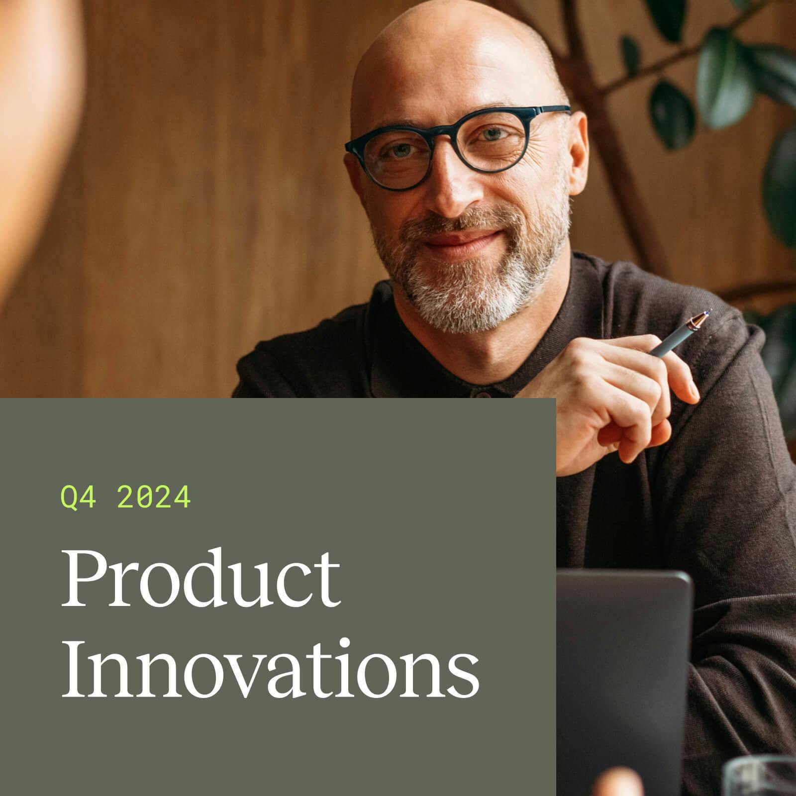
We knew our redesign needed to humanize our brand by focusing on showing real people and highlighting real stories. We have consciously avoided AI-generated images and cheesy stock photos, opting instead for genuine visuals that convey warmth and emotion. Our collaboration with Stocksy has enabled us to curate a library of images that feel human and unified.
We want our customers to see themselves (and their customers) reflected in our brand. This means showing a diverse range of people that accurately represents the world around us. Our visuals depict customers on the go and people in action, reflecting the dynamic nature of their lives and the ways in which our platform helps our customers reach their audience in those critical moments.

Colors
Our color palette is future-forward and optimistic, with a single vibrant color balanced by grounded, neutral tones. This combination reflects our dual commitment to innovation and stability. We aim to evoke both excitement and reassurance, much like how we balance cutting-edge technology with reliable performance. While mParticle offers industry-leading machine learning capabilities and predictive insights, we also offer the most trustworthy real-time data infrastructure.

Imagery
Our iconography is seamlessly integrated with our product UI updates, ensuring a cohesive experience between our external brand and the user interface. We've also embraced a clean, editorial graphic style that prioritizes clarity and ease of understanding. Trusting our audience, we've eliminated unnecessary bells and whistles, favoring a straightforward approach that communicates our enterprise focus effectively. Our product speaks for itself and our customers are smart; we don’t need to over-complicate things with our visuals.

Fonts
One of our goals with the rebrand was to enable faster execution as well. With a more strategic and connected brand design, we can execute marketing campaigns and product updates more swiftly and effectively, ensuring we remain agile and responsive to our customers' needs. By using accessible and approachable fonts, we can communicate more effectively.

Embracing the future with optimism
The mParticle rebrand is a testament to our belief in the power of customer data to create meaningful, joyful experiences. As we move forward, we remain committed to turning customer data into customer joy, guided by our refined mission and energized by our new visual identity.
Welcome to the new mParticle. Join us in ushering in the new era of the CDP.
Explore our platform, and see how we can help you create more joyful customer experiences today.


